There is a particular feeling that only happens inside a great train station. It’s not the feeling of an airport — that antiseptic, transactional anxiety. It’s something more generous. A great train station makes you feel like the act of going somewhere matters, and that the city you’re leaving has decided to dignify your departure.
I’ve spent time in a lot of train stations across a lot of countries. The ones that stay with me aren’t necessarily the most famous. They’re the ones where someone, at some point, made the decision that a transit building should be more than a transit building.
Cathedrals of Movement
The comparison between train stations and cathedrals is well-trodden, but it persists because it’s accurate. Walk into Antwerp-Centraal and you’re standing in a space that was designed with the same ambition as a place of worship. The soaring dome, the marble staircases, the light pouring through upper windows — none of this was structurally necessary. A flat-roofed shed with platforms would have moved the same number of passengers. But someone in the early 1900s decided that the experience of boarding a train should feel elevated. That the journey deserved ceremony.
The same impulse produced Grand Central Terminal in New York, the Gare de Lyon in Paris, Mumbai’s Chhatrapati Shivaji Terminus. These are buildings that announce: we believe travel is important enough to build a monument around it.
What’s fascinating is that the societies that built these stations were making a statement about themselves, not just about trains. A grand station says: we are connected to the world, and we want you to feel the weight of that connection when you step onto a platform. It’s infrastructure as identity.
The Decline and the Exception
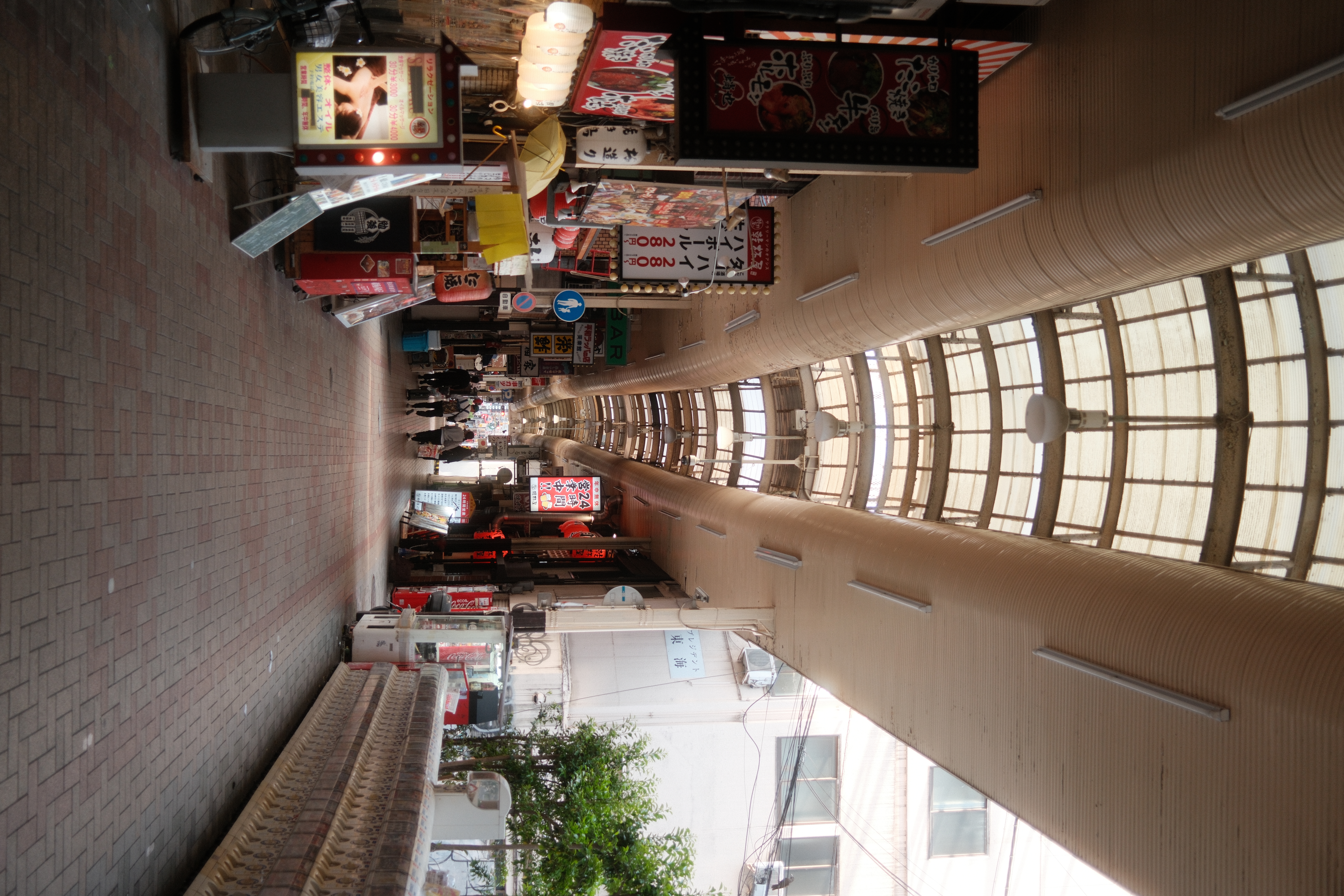
Somewhere around the middle of the twentieth century, most countries stopped building train stations this way. The shift to car culture, the rise of aviation, the general postwar aversion to ornament — all of it conspired to produce stations that feel like afterthoughts. Concrete boxes with fluorescent lighting and vending machines. Places you endure rather than experience.
There are exceptions, and they’re telling. Japan never stopped caring about its stations. Tokyo Station, Kanazawa Station, Kyoto Station — each is different, but each communicates that the designers understood something fundamental: the station is the first and last impression of a city. It’s the threshold. What you feel when you cross it shapes how you remember everything that follows.
The Nordic countries get this too. Spend time in Helsinki’s central station and you see a building that takes itself seriously without being pompous. The granite facade, the Art Nouveau details, the copper roof that’s turned green with age — it’s a building that respects both the traveler and the city. It says: we thought about this.
What Stations Teach About Design
Running a marketing agency has made me obsessed with thresholds. The first moment someone encounters a brand — a landing page, an email, a piece of content — is a kind of station. It’s the point of arrival. And most companies treat it the way most cities now treat their train stations: as a functional necessity, not an opportunity for meaning.
The best stations share a few qualities. They orient you immediately — you walk in and you understand where to go. They give you enough space to think but enough structure to move. They’re beautiful without being confusing. And they make the transition from one state to another — from standing still to traveling — feel intentional rather than accidental.
I think about this when we build landing pages for clients. The temptation is always to optimize for speed, for conversion, for the shortest path to a click. But the stations that stay with you are the ones that gave you a reason to look up. That made you feel like the journey you were about to take was worth a moment of pause.
The Platform Moment
There’s a specific moment in a great station that I think about often. It’s the moment you step onto the platform and see your train waiting. In a well-designed station, this moment has a quality of clarity to it. You’ve moved through the hall, past the boards, down the stairs or along the corridor, and now you’re here. The train is real. The destination is real. You’re about to leave.
In a bad station, this moment doesn’t exist. You shuffle through a crowd, find a number on a screen, stand on a concrete slab, and wait. There’s no transition, no threshold, no sense that anything is beginning.
The difference matters more than it should. Because the stations that give you that platform moment aren’t just moving your body from one place to another. They’re moving your mind. They’re telling you that what comes next is worth paying attention to. That departure itself is an act worth designing around.
I keep a running list of the stations that have done this to me. It’s one of my stranger travel habits. But it’s taught me something I use every day: the quality of a transition determines the quality of what follows. The companies that understand this — the ones that design their onboarding, their first emails, their initial touchpoints with the same care that Antwerp-Centraal was designed — are the ones that earn attention they never have to buy back.