I was standing in the Designmuseum Danmark in Copenhagen, looking at a chair, when something clicked.
It was a Wegner Wishbone Chair. You’ve probably seen one without knowing its name — the curved backrest, the woven paper cord seat, the light wood frame that looks like it’s made of two continuous lines. Hans Wegner designed it in 1949. Seventy-seven years later, it’s still in production, still in demand, still beautiful.
I stared at that chair for an unreasonable amount of time. Long enough that a museum guard glanced at me with mild concern. What I was trying to understand wasn’t the chair itself — it was why it felt so right. Why, among the thousands of chairs designed in the twentieth century, this one endured while others became dated, then ironic, then forgotten.
The answer, I think, applies to much more than furniture.
The Discipline of Removal
Scandinavian design’s defining characteristic isn’t what it includes. It’s what it removes.
The Wishbone Chair has no ornamentation. No carved details, no applied decoration, no visible screws or joints. Every element serves a structural or ergonomic purpose. The curved backrest isn’t curved for aesthetic reasons — it’s curved because that shape distributes the sitter’s weight more comfortably than a flat back. The Y-shaped splat that gives the chair its name isn’t decorative — it provides support while using less material than a solid back.
This is simplicity, but it’s not the lazy kind. It’s not the simplicity of doing less. It’s the simplicity of doing exactly enough — where every element that remains has earned its place through function, and the absence of everything else is what creates the beauty.
There’s a Finnish word for this: “tarpeellinen.” It means “necessary” but carries a connotation of sufficiency — not just what’s needed, but the recognition that what’s needed is enough. It’s the philosophical opposite of “more is more.” It’s the belief that the right amount is the beautiful amount.
I’ve been thinking about this principle ever since that afternoon in Copenhagen, and I keep finding it applicable to things that have nothing to do with furniture.
What I Saw in Copenhagen
I spent a week in Copenhagen, and the design philosophy isn’t confined to museums. It’s in the infrastructure.
The bicycle lanes aren’t just paint on a road. They’re physically separated from car traffic, slightly elevated, with their own traffic signals. The design is so intuitive that I, a tourist who hadn’t ridden a bicycle in two years, was navigating the system within ten minutes. No instruction manual. No learning curve. Just a system that communicates its own rules through its design.
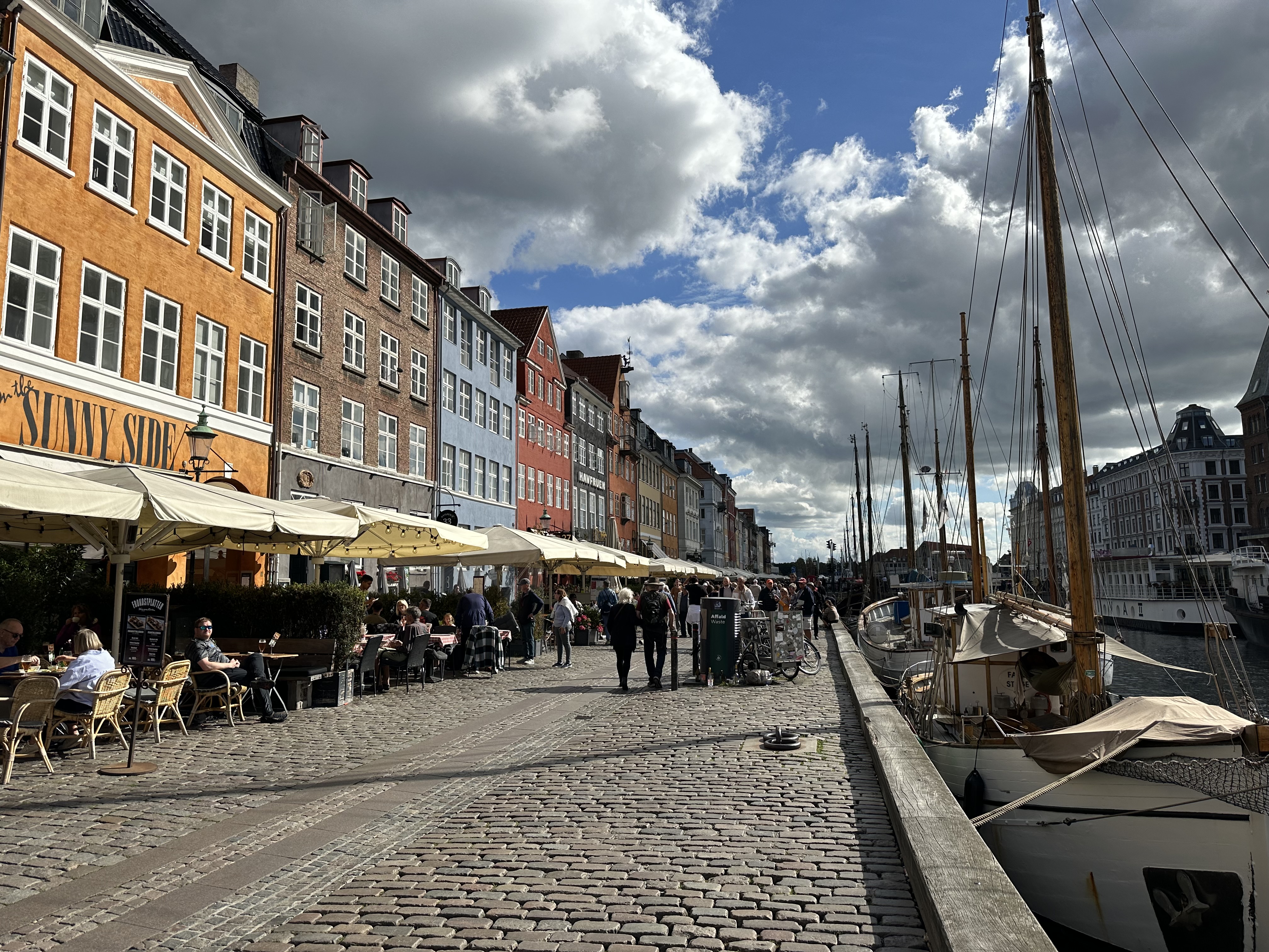
The public spaces are the same. Nyhavn — the famous harbor — is beautiful not because it’s ornate but because the proportions are right. The buildings are the right height relative to the canal width. The colors are bright but not garish. There’s enough space for people to sit and enough activity to keep the space alive. It feels designed but not over-designed.
Even the grocery stores feel different. Irma, a Danish chain, arranges products with the kind of visual care that you’d expect from a boutique. Clean labels, clear hierarchy, no visual noise. Shopping there felt calm. I’ve never described a grocery store as calm before.
The Danish concept of “hygge” — the feeling of coziness and contentment — is often reduced to candles and blankets in American lifestyle magazines. But the real meaning is more interesting. It’s the deliberate creation of environments that support well-being. Not through luxury, but through care. The right lighting. The right texture. The right scale. Every choice made with awareness of how it affects the person in the space.
Stockholm’s Restraint
I visited Stockholm a year before Copenhagen, and the Swedish expression of Scandinavian design is subtly different.
Where Danish design tends toward warmth — natural wood, curved forms, organic shapes — Swedish design is cooler and more systematic. Think IKEA at its best, not the flat-pack furniture of the jokes, but the underlying philosophy: democratic design, where good design is available to everyone, not just the wealthy.
The Stockholm metro is often called the world’s longest art gallery. Over ninety stations, each designed by a different artist, each unique. But the system design — the wayfinding, the maps, the schedules — is consistent and clear. The art varies. The usability doesn’t. That’s a design decision that reflects a value: beauty should enhance function, not compete with it.
I spent an afternoon in the Nationalmuseum after its renovation, and the building itself is a lesson. The renovation preserved the historical architecture while adding modern interventions that are clearly modern — no fake period details, no pretending the new parts are old. The old and new coexist honestly. Each is what it is.
That honesty — in materials, in construction, in intention — is a through-line in Scandinavian design that I find increasingly rare elsewhere. In most design traditions, the goal is to create an impression. In Scandinavian design, the goal is to create clarity.
Helsinki and the Edge
Finland pushes Scandinavian design toward its most austere expression.
The Finnish architect Alvar Aalto designed buildings and furniture that look almost impossibly simple. His Savoy Vase — a free-form glass vase designed in 1936 — is just a wave of glass. No handle, no foot, no ornamentation. It’s the shape of water frozen in mid-motion. It’s been in continuous production for ninety years.
Finnish design has a quality that Danish and Swedish design sometimes lack: an edge. A willingness to be uncomfortable. The Helsinki Design Museum has pieces that are beautiful in the way that a very cold morning is beautiful — striking, clarifying, not entirely welcoming.
I think this edge comes from the Finnish relationship with nature, which is less romantic than the Danish version. Finland is dark for months. The landscape is sparse. The cold is genuine. Finnish design doesn’t soften these realities — it acknowledges them. A Finnish sauna isn’t designed for comfort in the usual sense. It’s designed for an experience that’s intense, cleansing, and slightly punishing. The design supports the function, and the function is confrontation.
Simplicity Is Harder Than Complexity
This is the part that’s most relevant to my work, and to anyone who designs products, interfaces, or communications for a living.
Simplicity is exponentially harder than complexity.
It’s easy to add. It’s easy to include another feature, another section, another paragraph, another design element. Addition requires no judgment — just accumulation. A complex design can hide confused thinking behind sheer volume. “We included everything” sounds like thoroughness. Usually it’s indecision.
Simplicity requires decisions. Every element that makes the cut has been evaluated against the question: does this earn its place? Every element that’s removed has been evaluated against the question: does the whole suffer without this?
When we design landing pages for clients at PipelineRoad, I push for this discipline relentlessly. The first draft of any landing page has too many sections. Too many value propositions. Too many testimonials. Too many CTAs. The client wants everything represented because everything feels important.
The work is in the editing. Which three value propositions are doing 80% of the persuasive work? Keep those. Which testimonial is most specific and credible? Keep that one. Which CTA is the actual next step? One button. Not three.
The resulting page converts better. Not because it’s pretty, though simplicity often is. But because it’s clear. The visitor understands what the product does, why it matters to them, and what to do next. They understand this in fifteen seconds, not sixty. And in a world where attention is the scarcest resource, fifteen seconds of clarity beats sixty seconds of comprehensiveness every time.
Design as Communication
The deepest lesson of Scandinavian design isn’t aesthetic. It’s communicative.
Good design communicates its purpose without explanation. The Wishbone Chair tells you how to sit in it. The Copenhagen bike lane tells you how to use it. The Finnish sauna tells you what to expect. No manual required.
Good marketing should work the same way. A landing page should communicate its purpose without requiring the visitor to decode it. An email should communicate its value without requiring the recipient to search for it. A brand should communicate its positioning without requiring the audience to interpret it.
Most marketing fails this test. It’s cluttered with messages competing for attention. It’s decorated with elements that add visual interest but obscure meaning. It optimizes for impression instead of clarity.
Every time I’m tempted to add another section to a page, another line to an email, another feature to a product description, I think about that chair in Copenhagen. Every element earns its place. The absence of everything else is the design.
The Paradox of Effortlessness
The final thing about Scandinavian design: it looks effortless. The Wishbone Chair looks like it just happened — like the wood naturally bent itself into that shape. The Copenhagen streetscape looks like it just grew that way.
This effortlessness is, of course, an illusion. Wegner made hundreds of prototypes before the Wishbone Chair reached its final form. Copenhagen’s urban design is the result of decades of deliberate planning, political negotiation, and infrastructure investment.
The effort creates the effortlessness. The complexity of the process produces the simplicity of the result. This is true of great design, great writing, great marketing, and great strategy.
The best work looks like it was obvious. It looks like anyone could have done it. That feeling — the “of course, that’s right” feeling — is the highest achievement of design. And it’s the hardest to produce, because it requires you to do the hard work of removal, decision, and refinement, and then hide the evidence.
Simplicity isn’t where you start. It’s where you arrive, after you’ve had the courage to take everything away that doesn’t earn its place.
A seventy-seven-year-old chair taught me that. I’m still learning how to apply it.