The short version
- An arrivals hall optimises for orientation before instruction. Most product onboarding does the reverse.
- Every user arrives depleted. Onboarding designed for a rested, motivated user is designed for a user who does not exist.
- Wayfinding beats tutorials. Showing where things are outperforms explaining how they work.
- The moment worth engineering is the first sightline, not the first click.
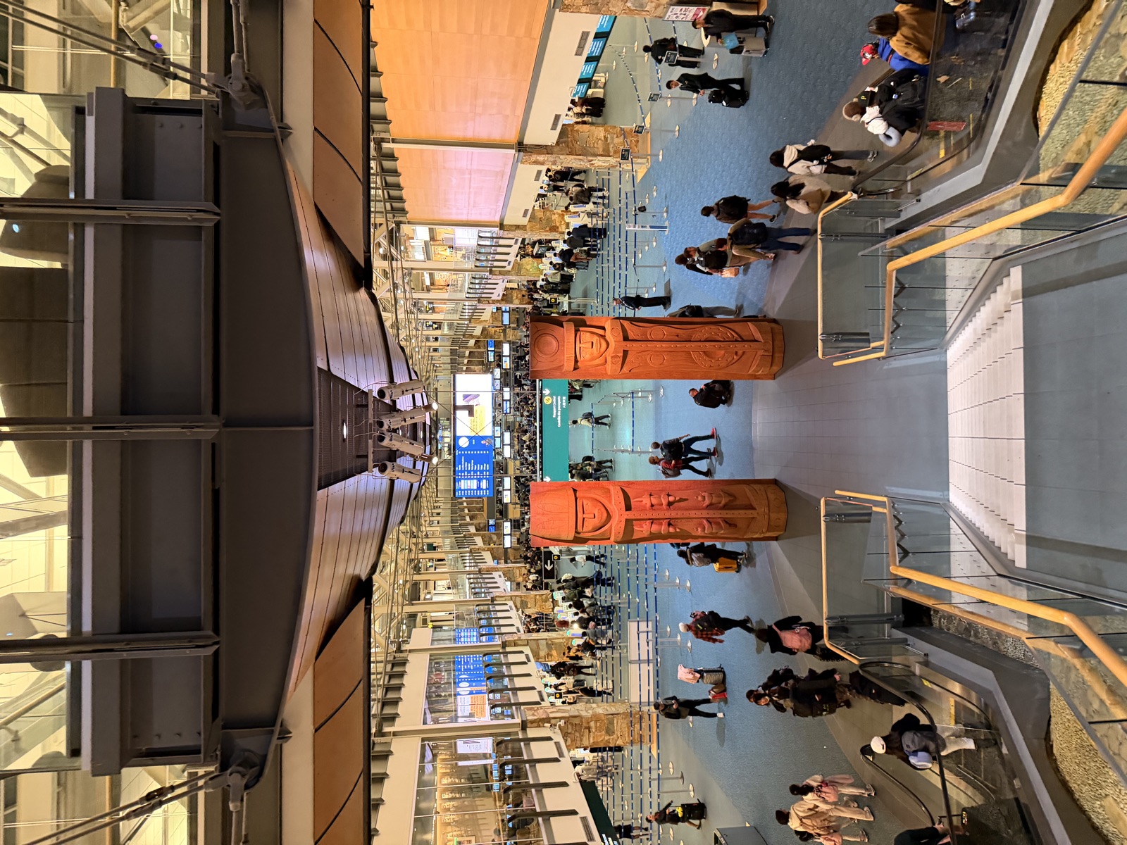
You come down an escalator into the arrivals hall at Vancouver and the first thing in front of you is a pair of carved welcome figures, standing where the sightline lands. Behind them, the queue. It is the most honest onboarding flow I know of: one chance, no instructions, every user tired, carrying something, and unable to leave. Airports have been solving this problem for decades and software companies keep solving it from scratch and worse.
What does an arrivals hall get right?
It answers where am I before it asks anything. The sightline from the escalator lands on something that says which country you are in and what kind of place this is, and only after that do you encounter the process. Orientation, then instruction, then transaction, in that order, every time.
It also assumes depletion. Every design decision in that hall assumes the user is tired, carrying luggage, possibly in the wrong time zone and possibly unable to read the local language. Nothing depends on the user being sharp. Compare that with a product tour that assumes someone will read six tooltips in sequence.
And it has no exit. The user cannot leave, which sounds like an advantage until you realise it is why airports invest so heavily in orientation. A trapped, confused user becomes an angry one. A software user just closes the tab, which is cheaper for them and much more expensive for you.
Arrivals hall against typical product onboarding.
| Design question | Airport answer | Common product answer |
|---|---|---|
| First thing the user sees | Where they are | What a feature does |
| Assumed user state | Tired, carrying, distracted | Rested, focused, curious |
| Primary mechanism | Wayfinding signs | Sequential tooltips |
| Empty state | Signposted, staffed | Apologetic and blank |
| Success in the first minute | Pointed in the right direction | Completed a tour |
Why does most product onboarding invert the order?
Because it is designed by people who already know where they are. When you know the product, orientation seems trivial and the interesting problem is teaching features. So the tour starts with what things do rather than with what this place is, and the new user is being taught the controls of a building they have not yet located themselves in.
The symptom is a tour that gets dismissed. Dismissal rates are usually treated as a design failure of the tour. More often the tour is answering a question the user has not reached yet.
What does wayfinding look like in software?
It looks like structure being visible before it is used. A navigation that shows the whole shape of the product on first load rather than progressively revealing it. Empty states that describe what will be here rather than apologising for being empty. A first screen that makes the map obvious even though nothing has been done yet.
The airport version of this is the overhead sign you can read from thirty metres away, which tells you the three things that exist and roughly where they are. It does not explain immigration policy. It gets you pointed correctly and lets the details arrive when you are close enough to need them.
We ran an onboarding review on an account where the CRM audit found roughly 98 percent of contacts sitting in the first lifecycle stage with nothing behind them. That is the same failure at company scale. Everyone arrived and nobody was pointed anywhere, so they stayed at the door.
How do you design for a depleted user?
Assume no reading. Assume one hand. Assume interruption. Then check whether the first minute still works. Most onboarding survives none of those assumptions, because it was tested by people who were paying full attention and had a reason to persevere.
Then cut the first session to a single outcome. Not a tour of five features, one thing the user came to do, completed. Everything else can wait for the second session, and if there is no second session then the five features were never going to matter anyway.
The first screen is not an introduction to the product. For most of the people who will ever see it, the first screen is the product.
What is the first ninety seconds worth?
Disproportionately much, and for a reason borrowed from how machines read pages as well as how people do. Research on generative engine visibility found that 44.2 percent of citations come from the first 30 percent of a page. Attention front-loads. What is at the top gets used and what is below it frequently does not exist.
The practical version is that the first screen is not an introduction to the product. It is the product, for most of the people who will ever see it. Treating it as a preamble is how good products lose users who never found out they were good.
Related: auditing the funnel before adding traffic, context beats explanation and field notes from the same run of trips.
Frequently asked questions
What should product onboarding show first?
Orientation before instruction. Where the user is and what kind of place this is, then how things work. Most tours reverse the order and teach controls to someone who has not yet located themselves.
Why do users dismiss onboarding tours?
Usually because the tour is answering a question they have not reached. Dismissal is treated as a design failure of the tour when it is more often a sequencing failure, with feature explanation arriving before orientation.
How do you design onboarding for a distracted user?
Assume no reading, one hand and interruption, then check whether the first minute still works. Also cut the first session to a single completed outcome rather than a tour of several features.
Why does the top of a page matter so much?
Because attention front-loads and machines read the same way. Research into generative engine visibility found 44.2 percent of citations come from the first 30 percent of a page. What sits below that frequently does not register at all.
What is wayfinding in a software product?
Making the structure visible before it is used. Full navigation on first load, empty states that describe what will live there, and a first screen that makes the shape of the product obvious even when nothing has happened yet.
What is the company-scale version of bad onboarding?
A CRM where everyone sits at the first lifecycle stage. On one audit we found roughly 98 percent of contacts stuck there with no nurture behind them, which is a whole funnel of users who arrived and were never pointed anywhere.
Sources
- Chua Network delivery data across 8 client accounts (internal fact bank)
- GEO study, Princeton, Georgia Tech, Allen Institute for AI and IIT Delhi, KDD 2024
- Chua Network engagement records, anonymized (internal experience bank)