The short version
- The floor is a controlled experiment: identical traffic, identical attention budget, one variable, which is what you chose to say.
- The four common failure modes are the category-less claim, the invisible product, the borrowed adjective and the spectacle with no bridge.
- A booth that has to be explained by a person standing next to it is a booth that will not survive as a web page, where nobody is standing next to it.
- Test your own positioning the same way: cover the logo, show the headline to someone outside your market, and ask what the company sells.
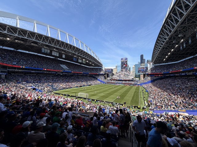
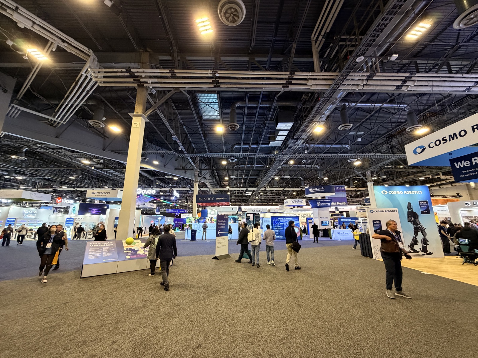
Stand in the middle of a hall like this one and you are looking at hundreds of independent attempts to answer the same question: what are you, in three seconds, to a stranger who is walking. Most of them fail. What is worth noticing is that they fail in a small number of repeatable ways, and those ways are the same ways a homepage fails. The show floor is just a faster feedback loop for the same problem.
Why is a show aisle a fair test of positioning?
Because the traffic is the same for everyone. Online, one company gets branded search and another gets a cold display click, so their conversion rates are not comparable and the message is only one of several variables. In an aisle, everyone gets the same walking crowd, at the same time of day, with the same fatigue level. What differs is the sign, the staging and the first sentence.
It is also brutally time-limited. Nobody scrolls a booth. You get the width of your stand at walking pace, which is a few seconds, and then the visitor is at the next company. That is a harsher version of the same constraint a landing page has, and a message that survives it tends to survive on a page too.
Four ways a stand fails, and the web page equivalent.
| Failure on the floor | What it looks like | Same failure on a site |
|---|---|---|
| Claim with no category | Abstract sign, unclear what is sold | Headline that never says what the product is |
| Invisible product | Nothing running, nothing to look at | Hero with an illustration and no interface |
| Borrowed adjective | Same word on dozens of signs | Category buzzword in the H1 |
| Spectacle with no bridge | Crowd photographs it and leaves | Video that entertains and never converts |
| Human-dependent message | Only makes sense once staff explain | Page that assumes a sales call happened first |
What are the failure modes you see repeatedly?
The first is a claim with no category. A large sign says something like intelligent orchestration for the connected enterprise and the visitor has no idea whether this is software, a chip or a consultancy. The company has skipped the step where the reader learns what kind of thing it is, which is the step that has to come first.
The second is the invisible product. Software companies suffer badly here. There is a stand, a logo and two people, and nothing to look at, so nothing stops the walk. On a web page this becomes the hero section with an abstract illustration and no product surface anywhere above the fold.
The third is the borrowed adjective. Every hall has a word that dozens of exhibitors have adopted in the same season. Once a word is on forty signs it has stopped distinguishing anyone, and using it costs you the same three seconds while communicating nothing.
The fourth is spectacle with no bridge. A striking object draws a crowd and then nothing connects the object to the product, so people photograph it and leave. Attention that does not hand off to comprehension is just expensive footfall.
What do the stands that work have in common?
They show the thing. Not a rendering of the thing, the thing, running, in a state that makes sense at a glance. The strongest small stands I saw put the product in its actual context so that no explanation was required, which is a technique that transfers straight to a landing page.
They also name a category before they make a claim. Category first, differentiator second. It reads as less ambitious and it works, because a stranger cannot evaluate a claim about a thing they have not yet classified.
How do you run this test on your own site?
Cover the logo and show the headline and hero image to someone outside your market for five seconds, then ask two questions: what does this company sell, and who is it for. If they cannot answer both, the page has the same problem as the sign in the aisle. This costs nothing and almost nobody does it.
Then check the adjective. Search your primary claim word and count how many companies in your category use it in their own headline. If the answer is a lot, you have bought a sign that says the same thing as the sign next to it.
The last check is whether a product surface appears above the fold. We treat this as a default rather than something to test each time, for the same reason a running demo stops people in an aisle and an empty stand does not.
A stranger cannot evaluate a claim about a thing they have not yet classified.
What does this mean for how you brief a homepage?
Brief it as if there is no salesperson standing next to it, because there is not. Any part of the message that only works when a human is present to fill the gap will fail on the page. That is the single most useful translation from the floor to the browser.
And accept the ordering. What kind of thing this is, who it is for, what it does better, then proof. Companies keep trying to lead with the differentiator because the differentiator is the interesting part to them. The visitor is not there yet.
More from the same three days: how I run the trip itself, the gap between what you show and what you sell and when a product line has no connecting line.
Frequently asked questions
What is the fastest way to test whether positioning is clear?
Show the headline and hero image, with the logo covered, to someone outside your market for five seconds and ask what the company sells and who it is for. If they cannot answer both, the positioning is not clear regardless of how much internal agreement it has.
Should a headline lead with the category or the differentiator?
Category first. A reader cannot judge a differentiator until they know what kind of product they are looking at. Leading with the differentiator feels bolder and consistently costs comprehension.
Why do software companies struggle more at trade shows?
Because there is nothing to look at. Hardware stops people by existing. Software has to be staged into a visible situation before it stops anyone, which is the same problem it has above the fold on a website.
How do you know if your key claim word is overused?
Count how many direct competitors use it in their own headline. If it appears across most of the category, it has stopped carrying information and is occupying the most valuable words on your page.
Is spectacle ever worth it in marketing?
Only when something connects the spectacle to the product within a few seconds. Attention that does not hand off to comprehension produces photographs and no pipeline, which is an expensive outcome to be pleased with.
How does this apply to B2B rather than consumer products?
More strongly, because B2B buyers are usually evaluating several vendors at once under time pressure. The comparison conditions are closer to an aisle than to a considered solo purchase, and clarity beats cleverness by a wider margin.
Sources
- Chua Network delivery data across 8 client accounts (internal fact bank)
- Chua Network engagement records, anonymized (internal experience bank)
- GEO study, Princeton, Georgia Tech, Allen Institute for AI and IIT Delhi, KDD 2024